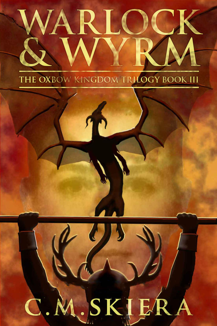
I agree on the font boredom, but I actually don’t think this would be too bad without the giant superfluous ghost face. “An Epic Fantasy Novel” also seems really redundant with the art plus the title (and of course “by” needs to go bye-bye).
Note to the cover designer: surprisingly, Dragons rarely fly straight up like Atlas booster rockets on the butt of a space shuttle heading out, and moreover, they don’t give two s**ts about symmetry. They’re just dragony that way.
Plus, oh-person-who-draws-dragons, you ever try to create TWO sets of shoulder blades? DUH. If you draw a dragon with four LEGS plus a set of wings, you have to create a back structure that has TWO shoulder girdles, etc.
Sheesh. You’d think that the artist had never seen a real dragon before!
The innocent face fading into the background is really confusing. A serious fantasy novel or a happy children’s book?
And bad font choices, too much text, and too much CAPS.
W Arlock & Wyrm sounds like the name of a law firm.
Gary
6 years ago
I don’t think the art is THAT bad, but the text goes out of its way to cover it. I swear that I looked at if for a LONG time before the face popped out at me. The face is a photo, right? I don’t like the iffy combo of iffy art and iffy photo.
axolotl
6 years ago
The photograph of the face is bad, but I don’t think the artwork is that terrible. It would be a serviceable cover were there not so much crappy text obscuring it. The title could be made smaller to fit between the wings and the author’s name smaller so it blocks Antler Helm Guy less, and the superfluous and obvious ‘epic fantasy novel’ text pared away.
L-Plate Pen
6 years ago
Warlocks gotta weightlift if they wanna hang with wyrms.
Once again I’ve been unable to resist the temptation to take their image and mess about with it. Excuse the iffy edges to the guy and the dragon – that’s what you get with trying to paint the original text out QUICKLY …
At any rate, the idea was to make the text smaller and nicer, defringe the face a bit, and put a bit of sinuous life into the dragon:
Yes, I used Trajan again; couldn’t be arsed to download a fantasy font. A really ornate script ampersand might work?
I agree on the font boredom, but I actually don’t think this would be too bad without the giant superfluous ghost face. “An Epic Fantasy Novel” also seems really redundant with the art plus the title (and of course “by” needs to go bye-bye).
Note to the cover designer: surprisingly, Dragons rarely fly straight up like Atlas booster rockets on the butt of a space shuttle heading out, and moreover, they don’t give two s**ts about symmetry. They’re just dragony that way.
Plus, oh-person-who-draws-dragons, you ever try to create TWO sets of shoulder blades? DUH. If you draw a dragon with four LEGS plus a set of wings, you have to create a back structure that has TWO shoulder girdles, etc.
Sheesh. You’d think that the artist had never seen a real dragon before!
The innocent face fading into the background is really confusing. A serious fantasy novel or a happy children’s book?
And bad font choices, too much text, and too much CAPS.
…and lack of kerning on that first “WA”
Maybe the title begins W Arlock?
W Arlock & Wyrm sounds like the name of a law firm.
I don’t think the art is THAT bad, but the text goes out of its way to cover it. I swear that I looked at if for a LONG time before the face popped out at me. The face is a photo, right? I don’t like the iffy combo of iffy art and iffy photo.
The photograph of the face is bad, but I don’t think the artwork is that terrible. It would be a serviceable cover were there not so much crappy text obscuring it. The title could be made smaller to fit between the wings and the author’s name smaller so it blocks Antler Helm Guy less, and the superfluous and obvious ‘epic fantasy novel’ text pared away.
Warlocks gotta weightlift if they wanna hang with wyrms.
Once again I’ve been unable to resist the temptation to take their image and mess about with it. Excuse the iffy edges to the guy and the dragon – that’s what you get with trying to paint the original text out QUICKLY …


At any rate, the idea was to make the text smaller and nicer, defringe the face a bit, and put a bit of sinuous life into the dragon:
Yes, I used Trajan again; couldn’t be arsed to download a fantasy font. A really ornate script ampersand might work?